
Sweet Sunshine Co.
Sharing Sunshine, One Cup at a time


Overview
Sweet Sunshine Co. is a community-driven lemonade stand brand created to feel warm, welcoming, and family-oriented. The concept blends cheerful visuals with a wholesome message — “Sharing Sunshine, One Cup at a Time.”
The Challenge
The goal was to design a brand identity that goes beyond a simple lemonade stand. It needed to:
Feel approachable for families and children.
Stand out at markets, fairs, and community events.
Communicate joy, freshness, and togetherness.
The Solution
I developed a full brand identity system that captures the essence of sunshine and community.
Logo Design: A playful sun + lemon hybrid with a friendly rounded font.
Color Palette: Bright yellows, leafy greens, warm peach, and sky blue to reflect joy, nature, and optimism.
Typography: Rounded, approachable typefaces paired with clean sans-serifs for balance.
Visual Elements: Hand-drawn lemon slices, rays of sunshine, and pattern accents to keep the brand lighthearted and memorable.
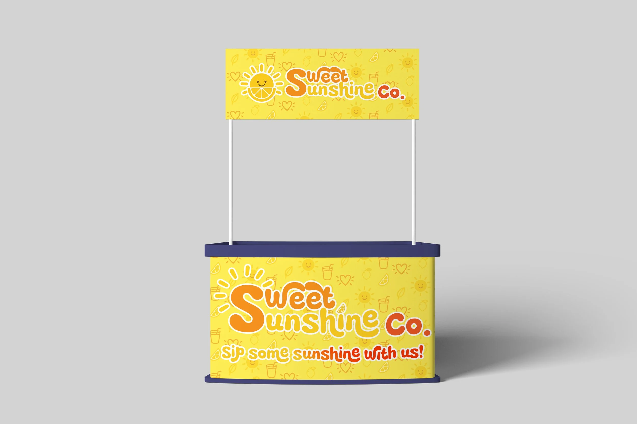
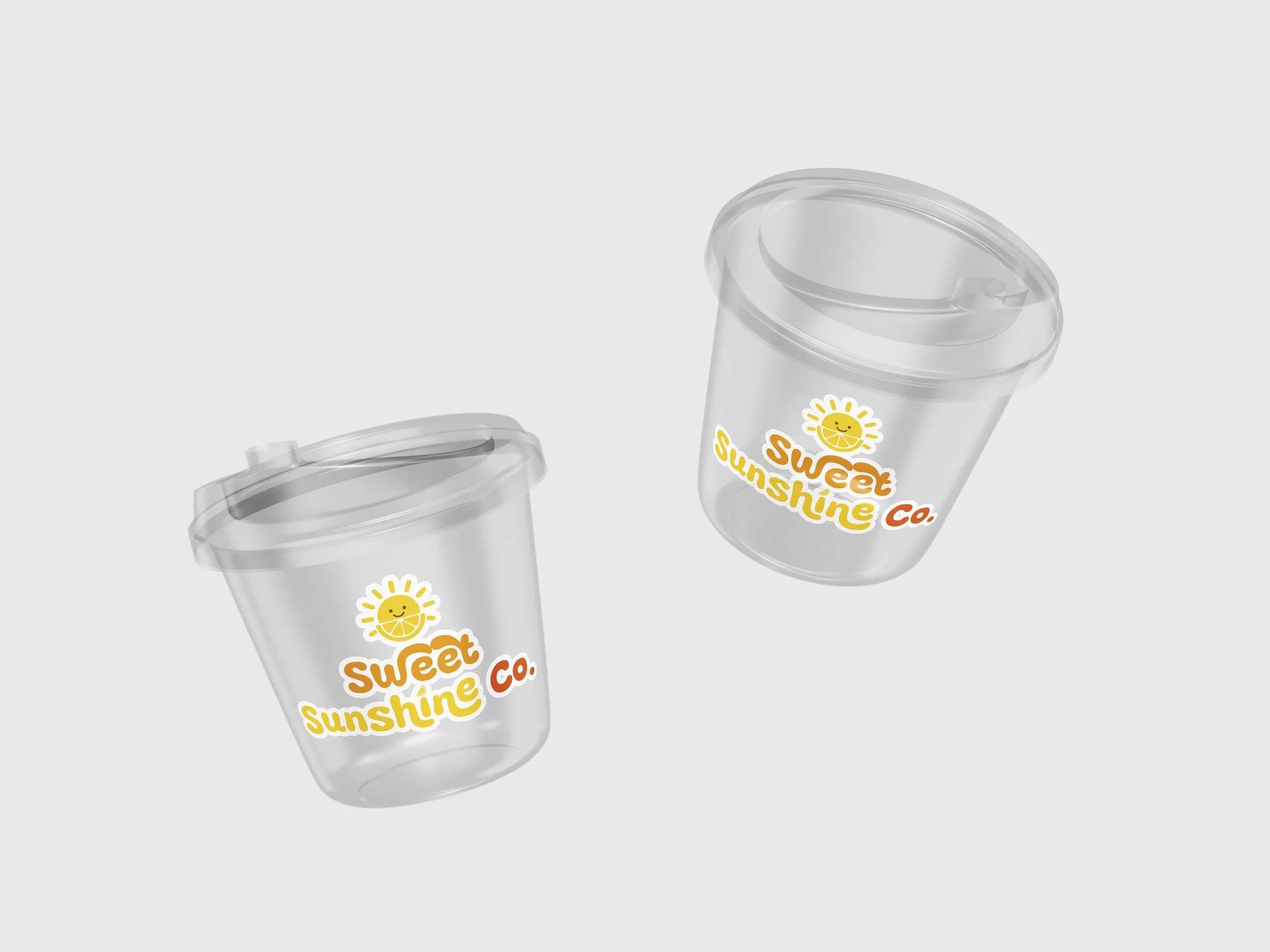
Packaging & Signage: Eco-friendly cups, stickers, and retractable banner designs for events, using bold, easy-to-read layouts.
Deliverables
Primary & Secondary Logos
Submark & Icon Set
Brand Guidelines (color, type, visual assets)
Packaging Mockups (cups, stickers, labels)
Marketing Collateral (retractable banner, business cards, menu board)
Social Media Templates
Result
The finished identity positions Sweet Sunshine Co. as more than a stand — it’s a community brand built around joy, family, and connection. With playful yet professional design, the brand feels both nostalgic and fresh, appealing to kids, parents, and event-goers alike.